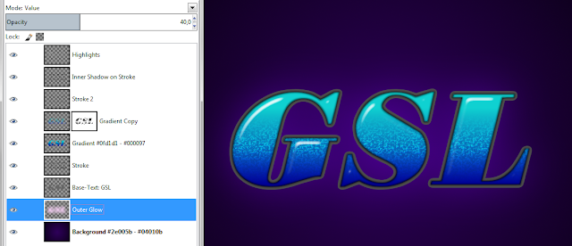
This texteffect started when i browsed
some Photoshop layerstyle tutorials.
I like to see if i can imitate those
tuts with Gimp and most of the time something useful comes out of the
experience.
You can see the original tutorial here:
I didnt follow it very closely, just
trying to get the basic look with my own twist and judging by the
reactions on Gimpchat, i got some good results.
(see these experiments here: Ombre)
So today, and by public demand, here is
a tutorial for the basic effect.
Its not a beginners tutorial, as most
of my tuts arent !
I just show you how to get there, you have to do
your homework on your own.
Lets start !
01. Create a new canvas 800 x 600 px
02. Drag a radial gradient from center
to way over the corner (something like 5cm) with these colours:
#2e005b - #04010b and make sure you have 'Adaptive Supersampling'
checked, for the best looking gradient !
03. type your text, in a medium grey
(#666666), i used the font Boden Esperanto 260px, Spacing 13
i did the other Ombre versions with
'Verve' and the font used in the original PS tutorial is 'Riot
Squad'.
You can find them here:
04. Alpha select your Basetext and save
the selection to a channel for future use
05. next we want to create the
highlights
duplicate the grey base text layer,
activate the selection and shrink it by 10
create a new transparent layer, name it
B-Map (or whatever you like)
fill the selection with white
deselect
Gaussian Blur by 16
activate the basetext copy layer and
apply a bumpmap with the B-Map we just created
for the values use a 'Depth' that will
leave the white bevel a bit „fuzzy“ - so dont go too high (3-6
seems good, 10 is too high)
turn up the 'Ambient' all to the max –
we want the highlights, not the shadows !
I used 'Sinusoidal' for the Type, but
'Linear' can work too
this is all up to your skills, its art
after all !
if you find a better way, please tell
me !
06. apply a 'Colour to Alpha' with the
colour of your base text (#666666), so the grey diappears and only
the white highlights remain
07. call up the `'Curves Tool' and set
it to alpha !
Shape the curve into a „meancurvature“,
like you see in my screenshot.
The angular shaped curve can vary,
depending on your highlight. Try to find the sweet spot between the two anchors by
experimenting with the shape.
What you want is something "sharp" without looking pixelated.
What you want is something "sharp" without looking pixelated.
Sometimes the right anchor needs to be
higher or more to the right.
You are aiming for an angular S-curve, that basically looks like this (but can end up as you see above):
You are aiming for an angular S-curve, that basically looks like this (but can end up as you see above):
If you are not happy with your result,
try blurring the highlight a bit (say 5) before you apply the curves.
08. Next create a new transparent layer,
name it 'Gradient' and activate the selection from your saved
channel.
Fill the selection with a linear
gradient of your choice and experiment a bit until you get a gradient
that has its transition in the middle of your text.
09. Duplicate the Gradient layer with
the selection still on and apply the 'Cubism Filter' (under
'Artistic'), with the values you see in the screenshot.
10. deselect and apply 'Colour to Alpha'
with black
11. add a white layermask to your
Cubism-layer and stroke on your mask (!), inside the base-text
selection, with a Bi-linear gradient, from white to black
What we want to achieve is that only
the middle part of the Cubism-layer is visible.
When you are happy, set the Mode to
'Dodge'
12. This step is optional, but it can
improve the overall effect:
activate the cubism layer and BumpMap
it with itself, Depth: 1 or 2.
13. Now we will add a Stroke.
Activate the base-text selection and
grow it. I used a value of 2.
Save the selection as a path, deselect
and stroke the path by 8 with a dark grey #4d4d4d (or whatever color
you like) on a new transparent layer named 'Stroke'.
That way, part of the Stroke will be
under your gradient layer. That is intentional !
Alternatively you can grow the
selection by, say 5, and fill it with the grey, but this may give you
jagged edges.
14. for a shadow effect on our Stroke,
create a new layer on top of the gradient/cubism layers and name it
'Inner Shadow 4 Stroke' (or whatever you like).
Activate the selection from channel,
Grow by 1, fill with black, deselect.
Call up the basetext selection again,
Shrink by 1 and hit delete.
Apply a Gaussian Blur of 4, set the
Mode to 'Burn' and reduce the Opacity to 75%.
If this still doesnt mask the jagged
edges of our gradient layers, create a new layer under the Inner
Shadow and name it 'Stroke 2'.
Convert the base-text selection to a
path and stroke it by 1 with black, then reduce the Opacity to 37%.
This is our base effect. Next we will
improve that effect even more.
DECO 1.
For an Outer Glow, call up your
basetext selection and grow it by the thickness of the stroke. Create
a new transparent layer under your base text and name it 'Outer
Glow'.
Fill the selection with a colour, i
used a pink, #ffd5fe, deselect and blur by 130.
I set the Mode to 'Value' at 40%.
DECO 2.
For a Bevel, duplicate the saved
channel and blur it by 22 for the B-Map.
Activate your Base Text Layer and
BumpMap it by 5. Leave the Azimuth and Angle the same as before.
Apply a 'Colour to Alpha' and get rid
of the grey, so that you are left with the Highlights and Shadows
only.
Put that layer on top of your Gradient
layers. I put the Mode to 'Grain Merge'.
If you want an extra step, duplicate
your Bevel layer and delete on one layer the white bits and on the
other one the black bits, so that you end up with a layer for the
shadows and one for the highlights.
That has the advantage that you can set
each layer to a different Mode.
DECO 3.
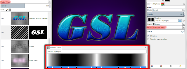
To add metallic highlights to our
stroke (according to anarkhya, thats an effect called „Marble“),
we will fill a new layer with a special gradient.
You can recreate it on you own with the
gradient editor, or download it from mediafire:
Stroke the gradient on a new layer
above your 'Stroke-layer', with the repeat set to 'Triangular'.
Dont overdo it, what you want is
something like three highlights per letter !
Then apply a layermask. I called up the
base-text-selection, grew by thickness of Stroke, minus 2pxs.
The Layermask 'From Selection'.
I set the Mode to 'Value' and the
Opacity to 50%.
DECO 4.
I wasnt happy with the background so i
changed the Lightness with 'Hue-Saturation' by -75.
Then i applied RGB-noise (0,02)
I also added a second Outer Glow on top
of the pink one, in white. It has a Blur of 10 and the Mode is set to
'Screen', Opacity at 40%.
This made me happy and concludes this
tutorial. Hope you find it useful !
Some thoughts (2019):
this effect as shown, has a few problems...
The ombre texture and the fat highlight are fine but the overall look lacks contrast.
This is especially because of the haze the outer glows create.
Today i would completely omit those.
The background is also much too dark, which is why i thought it was a good idea to add the bright outer glows.
Finally for getting a metallic stroke i would probably use the monsoonami chrome effect and colourize if needed. But generally speaking its very difficult to get a shiny effect on a stroke that is only a few pixels thick without generating jaggy edges, so perhaps its better to work on a larger scale.
Maybe i will re-write this effect some day....


1 comment:
worked fine, i think. not too hard to follow the tutorial - good with all the screenshots.
Post a Comment