How to do a video games-esque 3D text
with Gimp and Inkscape.
Open Inkscape (i used version 0.48).
If you have already set up a project in
Gimp, use the same pixelvalues for your document properties in
Inkscape
(thats under File → Document Properties).
(thats under File → Document Properties).
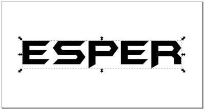
01. Type your text and center to the page with the
Aligment Dialog.
I used the font 'Batman forever'.
Then convert the text into a path:
a) Object To Path (CTRL + Shift + C)
b) Ungroup (CTRL + Shift + G)
c) Combine (CTRL + K)
EDIT 2016: instead of using the three above steps, a simple 'Union' will do the same.
I used the font 'Batman forever'.
Then convert the text into a path:
a) Object To Path (CTRL + Shift + C)
b) Ungroup (CTRL + Shift + G)
c) Combine (CTRL + K)
EDIT 2016: instead of using the three above steps, a simple 'Union' will do the same.
02. With that done, we want to apply perspective
to our text.
Put guides around your text to
make the job easier.
03. To apply the
perspective, we need a frame.
Drag the text out of the way, call up the Bezier Tool and make a
rectangle inside the guides, starting (!) from the lower left corner.
Then use the Node Tool to modify the
rectangle into a perspective shape.
If you select both upper nodes with the Node Tool and then hit the < Key (thats next to Shift on my keyboard) several times, both nodes will move in union towards each other.
If you select both upper nodes with the Node Tool and then hit the < Key (thats next to Shift on my keyboard) several times, both nodes will move in union towards each other.
04. Select your text, then include the perspective rectangle, you just made, into the selection by clicking again with the Shift key pressed, and go to:
'Extensions → Modify Path → Perspective'
'Extensions → Modify Path → Perspective'
Inkscape needs a few seconds to
calculate and then you'll get something like this:
Select the perspective path and drag it
out of the canvas or delete it, because we dont need it anymore.
If you need a second lesson for giving
text perspective, i recommend this excellent video by PhotoAdvanced2:
05. For the extrusion:
duplicate the text
and give it a lighter color, then drag it up a bit with the Ctrl key
pressed, so it only goes up in a straight line.
Then select the lower black text and
shrink it a bit while you hold down Ctrl + Shift, so it shrinks from
the center with the same aspect ratio.
In my case, i stretched the text a
little and drag it some more down afterwards to make it look good.
06. Next select the lower text first, and
then, while holding the Shift key, select the upper text as well and
go to:
'Extensions → Generate from Path → Interpolate'.
For Steps i used 8 and Check
'Interpolate Style' because otherwise you dont get the gradient effect
and your extrusion will be all the same color.
You will also want to check 'Duplicate
endpaths' because that will come in handy later, when we edit our
piece in Gimp.
Of course you can use colours other than grayscale for a coloured effect.
07. Next export your interpolation and the
upper text as individual png's (whole page) for editing in Gimp.
Make sure they are centered and aligned the same way so they will sit perfectly on top of each other when on seperate layers..
08. Fire up Gimp and open the Extrusion
png.
Then on top of that, open the Upper
Text as another layer.
09. Alpha select the Upper Text and apply a
gradient, in the colors you like. Make sure to check 'Adaptive Supersampling' for the best result.
10. Deselect and apply 'Posterize'. I used twelve levels.
11. Then you can start decorating:
I applied a bevel which was difficult
to get right, because i got a lot of jagged edges at the sides with this specific font.
Tweaked only the highlight with a curve
and made the gradient a bit lighter with another curve.
Added a Dropshadow with a Blur of 10
and Spread of 5. Mode: 'Grain Merge' 40%.
An Outer Glow with a Blur of 200
horizontically and 30 vertically, 'Grain Merge' at 70%.
Offset: Y: -5.
And a gradient for the background:
a90016 - 280040
a90016 - 280040
Finally i made an Inner Glow from
center, Shrink: 13, Blur 8 with an angular curve on 'Lighten Only' Mode at
46%.
I uploaded the xcf-file for people who want to have a closer look at what i did.


1 comment:
Thanks for Sharing.
Post a Comment